🎉 Clootrack recognized by OpenAI for crossing 100 billion tokens in Voice of the Customer analytics →
Read the story


Survey response rate is the foundation of survey reliability. If calculated incorrectly, it can mislead decision-makers, weaken the ROI of survey programs, and create a false sense of confidence in CX strategies.
A precise calculation ensures that leaders know whether feedback reflects the true voice of their audience or just a small, biased fraction. In research terms, the survey response rate definition is straightforward: it shows the proportion of validly invited participants who actually completed the survey, a key signal of engagement quality.
The standard formula is:
Survey Response Rate (%) = (Completed surveys ÷ Valid invitations sent) × 100
👉 This approach is sometimes referred to as the response ratio formula or the questionnaire response rate calculation formula in research, but the method and interpretation remain the same.
Two factors determine accuracy:
📌 Example: If 2,500 valid invitations were delivered and 400 customers completed the survey, the response rate = (400 ÷ 2,500) × 100 = 16%.
Leaders should approach survey response rate calculation as a disciplined process to reveal the authentic voice of the customer.

Use this checklist to strengthen the credibility of your insights:
Start with a cleaned, verified contact list and set your denominator from this list. A precise invite base ensures you are measuring engagement against a real audience.
Filter out bounces, blocks, and opt-outs. Delivered invitations reflect genuine opportunities to get responses, making your rate a measure of true reach.
Count only fully finished submissions. This prevents half-finished answers from introducing noise into your engagement metrics.
Use the calculation: Completed ÷ Valid invitations × 100. A consistent approach makes results comparable across teams, campaigns, and time periods.
Separate results by email, SMS, in-app, or phone. Channel-level reporting helps leaders see which methods deliver the strongest participation.
If using multiple channels, compute an overall rate, but retain visibility at the channel level for resource allocation and strategic planning.
Imagine a customer feedback campaign with the following results:
The response rate is:
(600 ÷ 4,800) × 100 = 12.5%
On its own, this tells you how engaged your audience was overall. But the real insight comes from breaking it down:
📍 Pro tip for leaders: For large-scale programs, many teams prefer using a survey response rate calculator to compare performance across campaigns and channels. The calculator applies the same formula but speeds up multi-channel analysis.
By moving beyond the headline number and analyzing channel-level dynamics, leaders ensure that survey budgets and outreach strategies are guided by evidence, not assumptions.
Missteps in how response rate is measured or interpreted don’t just distort engagement metrics — they lead to wasted CX spend and flawed strategic calls.
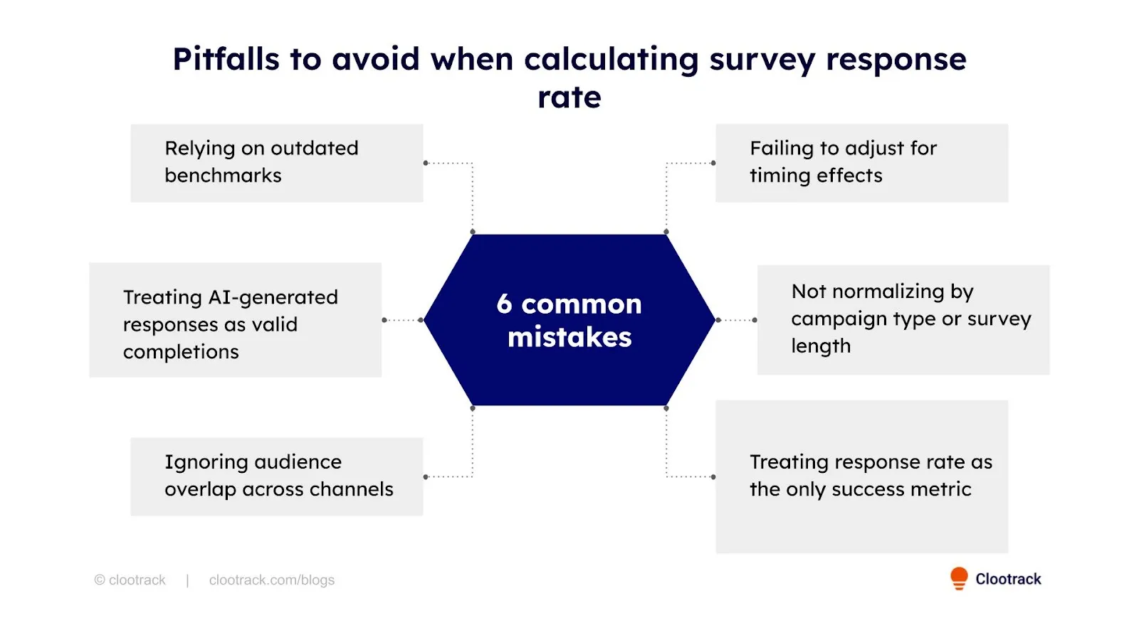
Here are the 6 most common pitfalls leaders must avoid:
Many leaders still compare their programs to pre-2020 standards, when email survey response rates were far higher. With low survey response rates across industries, using old benchmarks can make today’s healthy performance look like underperformance, driving unnecessary program changes.
Some companies experimenting with AI-assisted survey filling (internal bots or spam submissions) fail to filter these out. This artificially boosts response rates while diluting the authenticity of feedback, leading leaders to act on non-human data.
When the same customers receive surveys through email, SMS, and in-app, leaders sometimes double-count invitations in the denominator. This lowers the reported response rate and masks how many unique individuals actually engaged.
Response rates vary dramatically by when invitations are sent (e.g., weekday mornings vs weekends). Leaders who don’t account for timing windows may misdiagnose poor engagement as a channel issue rather than a scheduling problem.
Comparing a 2-question micro-survey to a 20-question NPS form without normalization leads to misleading conclusions. Leaders risk rewarding short-form surveys for “higher response” without considering depth and decision quality.
A high response rate doesn’t always mean high-quality insight. Leaders who rely on this number alone risk ignoring whether responses are representative, whether insights are actionable, or whether high engagement came from incentivized respondents with biased input.
Beyond avoiding these pitfalls, leaders should also track the inverse of response rate — nonresponse rate — to complete the picture of survey engagement.
Nonresponse rate shows the share of valid invitations that never became completed surveys — essentially the inverse of response rate. Tracking both together helps leaders see not just who engaged, but also the scale of missed voices, which is critical for spotting engagement gaps and bias risks.
Once the response rate is calculated, leaders can extract more value by analyzing how different factors shape engagement. These advanced breakdowns move the metric from a surface number to a decision-making tool:
Measure participation differences based on how customers entered your list — loyalty programs, transactional touchpoints, or marketing sign-ups. This shows which consent paths yield the most authentic feedback and helps prioritize the strongest data sources.
Compare responses across mobile, desktop, and tablet. Gaps often expose UX barriers: surveys that are difficult to complete on smaller screens or require too much typing. Leaders track device‑level splits to prevent skew, ensuring results don’t over‑represent the device with the smoother experience.
Track how much each reminder lifts response rates. Some audiences reply after the first nudge, while others only after the second or third. Knowing the point of diminishing returns prevents over-surveying and protects customer trust.
Analyze where customers abandon the survey — after a sensitive question, at a long free-text field, or mid-way through multi-page forms. Leaders use this to refine design, ensuring surveys remain respectful of customer time and attention.
When surveys are delivered across multiple channels (email, SMS, in-app), the order can shape results. For example, sending SMS first vs. email first may produce different engagement curves. Leaders who track sequencing patterns can optimize delivery for maximum impact.
Look at when responses arrive — immediately, within 24 hours, or only after a week. Faster responses often reflect higher engagement and fresher sentiment, while delayed responses may skew toward incentivized or less motivated customers.
📌 Leadership takeaway:
By breaking down survey response rates across sources, devices, reminders, sequencing, and timing, leaders transform a static percentage into a diagnostic map. This ensures survey programs stay efficient, representative, and aligned with customer realities.
Survey response rate alone is rarely enough. It becomes powerful when paired with other diagnostic indicators:
Together, these metrics show not just how many customers respond, but why others don’t.
Calculating survey response rate may look simple, but precision matters. Data hygiene, clear exclusions, and thoughtful segmentation ensure the number reflects reality, not noise. When calculated correctly, response rate becomes more than a statistic — it’s a benchmark leaders can trust to measure engagement, compare campaigns, and guide CX programs with confidence.
📌 For those who want to go beyond surveys, Clootrack helps leaders in capturing 100% of the VoC, including unstructured feedback from calls, chats, and reviews, while making the process effortless!
A typical survey return rate for customer surveys in 2025 falls between 10% and 30%, depending on channel and survey type. This range reflects the current benchmark leaders use to evaluate survey health. Anything above 30% is strong, while below 10% usually signals disengagement.
A survey’s response rate only matters if the sample is statistically robust. Leaders should focus on sample size, margin of error, and confidence level, ensuring respondents mirror the broader audience, not just hitting a percentage target.
When leaders ask how to calculate survey results, the method is straightforward: divide the number of responses in each category by the total valid responses, then multiply by 100. This gives the percentage of survey results for each answer choice. Unlike the response rate formula, which measures participation, percentage results show how respondents distributed their opinions across the survey.
Yes, what matters more than response rate is sample representativeness. Even with fewer responses, valid insights can emerge if respondents reflect the overall population. The risk lies in respondent bias skewing the outcomes.
Response rate becomes powerful when broken down, by channel, segment, timing, and consent source. This lets leaders reallocate resources strategically, optimize outreach, and ensure balanced, representative feedback.
Survey delivery mode influences how people answer. Leaders should interpret results in light of the mode used and avoid direct comparisons across modes without adjustment.
Events like holidays, natural disasters, or major news impact response timing and volume. Leaders should flag these external variables before attributing performance dips to survey design issues.
Share :
Analyze customer reviews and automate market research with the fastest AI-powered customer intelligence tool.