🎉 Clootrack recognized by OpenAI for crossing 100 billion tokens in Voice of the Customer analytics →
Read the story


This is a div block with a Webflow interaction that will be triggered when the heading is in the view.
Survey response rate is one of the most direct indicators of whether your feedback strategy is delivering usable insights.
As participation declines across channels, companies are finding it harder to gather enough data to guide decisions with confidence. Low response rates lead to weak signals, unreliable conclusions, and stalled ROI on survey programs.
Whether you're analyzing customer experience feedback, running market research, or validating product direction, response rate affects the depth, accuracy, and actionability of every dataset. And across email, SMS, web, and phone, rates are falling, forcing insights teams to rethink how they track, interpret, and act on feedback.
To solve that, this guide breaks down how to calculate your response rate, what healthy benchmarks look like by method and survey type, which companion metrics matter most, and what to do when traditional participation falls short.
So, let’s get started!
Survey response rate measures the percentage of people who complete a survey out of the total number who received the request. It’s one of the most critical metrics in survey-based research because it determines how representative and reliable your feedback data really is.
A strong response rate increases confidence in the results and ensures that insights reflect your broader audience, not just the most engaged or vocal participants. A weak rate, by contrast, raises the risk of nonresponse bias, poor segmentation accuracy, and flawed decisions.
Understanding the nuances between response rate and similar metrics is essential for interpreting feedback correctly and optimizing future campaigns.
These three metrics are often confused, but each reflects a different point in the feedback journey:
% of people who completed the survey out of those invited
Core benchmark for participation across your full sample
% of people who finished the survey after starting it
Highlights drop-offs during the survey; a low rate often indicates design or UX issues
% of people who started the survey out of those invited
Reflects how compelling your invitation is - subject line, send timing, and CTA all play a key role
All three metrics offer valuable insight. For example, a low response rate with a high completion rate often means your outreach is underperforming, not your survey content. Tracking them together gives a fuller picture of where breakdowns occur.
A healthy response rate does more than just boost sample size. It directly affects the credibility of your insights. With higher participation:
You reduce the risk of nonresponse bias, where only certain user types reply.
You increase the statistical power of your data, allowing more reliable segmentation and trend detection.
You create a more balanced and representative view of your full audience, especially when analyzing CX sentiment, churn drivers, or product feedback.
In enterprise settings, many organizations set minimum response rate thresholds (e.g., 15–30%) to ensure feedback meets internal data quality standards. Falling below that threshold means insights may no longer be valid for decision-making or reporting.
In short, no matter how sophisticated your analytics tools are, poor response rates degrade the foundation of insight generation.
Calculating survey response rate is essential for assessing the effectiveness of your outreach and data integrity. When calculated accurately, it helps leaders understand how well their survey campaigns are performing across channels and audiences.
Getting the formula right and knowing how it changes depending on delivery method and campaign setup is critical to tracking performance, benchmarking against industry norms, and identifying areas for improvement.
The most widely accepted formula is:
Survey Response Rate (%) = (Number of completed surveys ÷ Number of people invited to take the survey) × 100
For example, if you sent a survey to 5,000 customers and received 600 completed responses:
Response Rate = (600 ÷ 5,000) × 100 = 12%
This number gives you a quick view of how well your survey engaged its intended audience. It’s also the baseline metric most benchmarks refer to across channels and industries.
It’s important not to confuse this with open rates or click-through rates. Those track email performance, not actual survey participation.
In real-world survey programs, you may distribute surveys across multiple channels, like email, SMS, in-app, or even phone. Each channel will likely have its own response dynamics, so isolating and comparing them can provide insight into what's working best.
Single-channel example (email only):
Invitations sent: 3,000
Completed responses: 300
Response rate: (300 ÷ 3,000) × 100 = 10%
Multi-channel example (email + SMS):
Email invitations: 2,000 → 160 responses (8%)
SMS invitations: 1,000 → 190 responses (19%)
Combined total: 350 responses from 3,000 invites = 11.7% overall response rate
This breakdown helps highlight which channels are outperforming and which need rework, vital for budget allocation and outreach refinement.
Each survey distribution channel introduces unique tracking nuances that can affect how your response rate should be calculated. Here’s how to tailor your approach by method:
Email surveys: Use the number of successfully delivered emails—not total sends—as your denominator. Exclude bounces to ensure you’re measuring only real opportunities to respond.
SMS surveys: For accurate response rate calculation, count only messages delivered to active mobile numbers. Short, transactional SMS surveys can see response rates as high as 45%, but longer surveys (like NPS or multi-question flows) may average closer to 12%.
Phone surveys: Include only valid call attempts with the opportunity to participate. Exclude unreachable or disconnected numbers, and count completed calls where the full survey was conducted.
Web surveys: When surveys are embedded on websites or in apps, base the response rate on unique users who saw or clicked the survey prompt, not total site visitors. This ensures you're measuring actual exposure, not general traffic.
💡 Pro tip: Many survey platforms offer channel-specific metrics for delivery success, partial completions, and unique views. Be sure to align your calculations with what your tool actually tracks to avoid skewed data.
Survey response rate benchmarks vary significantly by how surveys are distributed. Understanding these benchmarks helps CX, research, and product leaders make smarter decisions about outreach, tooling, and targeting strategies.
Here’s a breakdown of current benchmarks by channel:
15–25%
Strong when personalized, well-timed, and concise. Long surveys reduce engagement.
40–50%
Offers high visibility and rapid replies, ideal for quick, transactional feedback.
20–30%
Best when triggered contextually (e.g., post-feature use or checkout).
5–15%
Performance varies by placement—QR codes and thank-you pages perform better.
~18%
Useful in B2B or regulated environments; engagement depends on call qualification.
These ranges reflect well-optimized campaigns in the U.S. market. Factors like industry, audience familiarity, brand trust, and message clarity still play a major role in actual performance.
Each survey delivery method affects more than just the number of responses; it shapes the quality, tone, and honesty of feedback. Understanding these behavioral dynamics helps teams choose channels that match their objective and audience mindset.
Email surveys often yield more thoughtful, detailed responses, especially in B2B or longer-form feedback. But inbox overload and poor timing can hurt visibility and engagement.
SMS surveys encourage quick, binary replies, ideal for transactional surveys and NPS. They offer speed and high response rates but limit nuance and open-ended input.
Web link surveys (via websites, QR codes, or landing pages) tend to capture impulsive or situational feedback. These rely heavily on placement and message clarity to avoid low-effort responses.
In-app surveys collect contextual feedback immediately after user actions. When well-timed, they boost relevance and accuracy, but poor placement disrupts UX and risks abandonment.
Phone or IVR surveys enable clarification and conversational depth, especially in B2B or regulated sectors. However, they introduce interviewer bias and may reduce honesty due to human presence.
💡 Pro tip: Use behavioral signals, not just survey response rates, to select the right channel. If you’re looking for quick NPS scores, SMS may be ideal. For rich sentiment, in-app or phone may work better.
The best survey channel isn’t the one with the highest average response rate. It’s the one that fits your audience, objective, and moment of engagement. Choosing the right method can make the difference between silence and actionable insight.
Here’s how to align the channel with intent:
Use SMS or in-app when timing is critical, such as post-purchase, support resolution, or transactional feedback. These channels work best when response windows are short, and immediacy matters.
Opt for email when you’re gathering richer input, like product research, CSAT diagnostics, or experience audits that require longer form responses, visuals, or embedded logic.
Deploy web or on-site prompts for real-time, spontaneous feedback, such as cart abandonment, rating widgets, or exit intent capture. These reach users mid-journey with minimal friction.
Use phone selectively in high-touch, enterprise, or regulated environments where direct interaction builds trust or where you need qualitative depth.
💡 Pro tip: Don't treat survey channels as isolated options. High-performing teams build multi-channel feedback journeys. Starting with email, following up via SMS or WhatsApp, and reinforcing in-app or onsite. This layered approach boosts response visibility and gives customers more control over how they engage.
The type of survey you send has a direct impact on how likely your audience is to respond. Certain formats perform consistently better than others, not because of the channel used, but because of how customers perceive their value, effort, and relevance. Understanding survey-type benchmarks helps teams prioritize where to invest effort and set realistic expectations.
Not all surveys are created equal. Here's how response rates vary across common survey types:
20–30%
Strong when sent immediately after interaction; under 15% suggests review of timing or messaging
10–20% via email, up to 20–30% via SMS/pop-ups
Email baseline around 12–15%, pop-ups push upper range
5–15%
Common for contextual prompts after feature use
15–35%
Higher with pre-qualified or incentivized participants
15–30%
Performs best when tied to recent customer actions
These are directional benchmarks. Actual rates can vary based on incentive, personalization, timing, and industry norms.
The reason behind a survey, whether to measure satisfaction, improve a product, or gather opinions, shapes how likely someone is to engage:
Transactional surveys (e.g., after a purchase or support call) get higher response rates because the moment is still fresh and emotionally charged.
Relationship surveys (like NPS) rely on broader sentiment and often need reminder nudges to boost participation.
Market research surveys typically perform better when users are incentivized or feel their opinion contributes to something larger than their individual experience.
Ad hoc product surveys may underperform if users feel their feedback won’t lead to a visible impact, or if the value exchange isn’t clear.
CX and product leaders must align the survey purpose with customer expectations. A misaligned ask (like an NPS survey after a bug report) lowers participation and damages credibility.
The way a survey is initiated—whether opt-in or triggered—directly affects its visibility, participation rate, and data quality.
5–12%
Appeals to highly engaged users in communities or loyalty programs
Prone to self‑selection bias and low generalizability
15–30%
Tied to real-time events like purchases or support chats, captures fresh, contextual feedback
Can feel intrusive if poorly timed or poorly worded
Opt-in surveys rely on voluntary participation and typically involve sign-ups or static links. They work well when targeting niche audiences or gathering qualitative insights from panels. However, they often underperform at scale due to limited reach and motivational bias.
In contrast, triggered surveys are event-driven, automatically sent after a defined user action. Because they catch users in the moment, they tend to yield more accurate, time-bound feedback. Their strength lies in immediacy, not just volume.
💡 Strategic takeaway: Use opt-in surveys to nurture community dialogue. Use triggered surveys to track operational touchpoints and capture feedback aligned to specific moments in the journey.
Survey response rate is only part of the story. To truly understand performance, you need to measure how each stage of your survey journey performs, from delivery to final submission. These companion metrics reveal where drop-offs happen and help pinpoint what needs fixing: the list, the message, or the survey itself.
Two essential metrics determine whether your invitation is even working:
Open rate = (Opened invitations ÷ Delivered invitations) × 100
→ Reflects subject line strength, timing, and sender recognition.
Click-through rate (CTR) = (Clicked survey links ÷ Opened invitations) × 100
→ Indicates whether the invitation content and CTA motivate action.
If open rates are low, recipients likely never noticed or trusted the email or SMS. If CTR is low, your message lacks urgency, clarity, or relevance.
💡 Interpretation tip: High opens but low CTR means your delivery works, but the content needs optimization. Reverse that, and your audience might not be seeing your invite at all.
These backend signals reveal whether your survey infrastructure is healthy:
Bounce rate = % of invitations that failed to reach inboxes or phones
→ Causes include bad contact data, opt-outs, or technical issues.
Delivery rate = % of successful message deliveries
→ A drop here points to list quality, ESP limitations, or SMS routing errors.
Partial completions = % of users who started but didn’t finish the survey
→ Often tied to poor mobile UX, long forms, or unclear progress indicators.
💡 Actionable insight: High partial completions mean users are willing to engage, until something interrupts them. Fixing this is often easier than boosting overall response rates.
Bringing these metrics together forms a full-funnel view of survey engagement:
Delivery rate
High bounce rate
List hygiene or technical issues
Open rate
Low interest or trust
Poor timing, sender reputation, subject line
Click-through rate
Weak CTA
Message not compelling enough
Completion rate
Drop-offs mid-survey
Survey too long or confusing
💡 Strategic takeaway: Teams that diagnose issues by funnel stage, not just by final response rate, can improve faster, reduce user friction, and dramatically increase total feedback quality.
Even when surveys look well-executed on the surface, with clean design, timely delivery, and strong CTAs, hidden methodological errors can quietly distort your response rate and undermine performance insights. These internal flaws often go unnoticed but can lead to bad decisions, misattributed success, and misleading benchmarks.
Here are the most common mistakes leaders should catch early and how to fix them.
In enterprise settings, CX, marketing, product, and support teams often send surveys independently. Without centralized coordination, this leads to:
Multiple requests in short succession, resulting in survey fatigue and increased opt-outs
Artificially low response rates, as customers disengage from overexposure
Skewed attribution, where one team’s metrics suffer because another over-surveyed the same audience
💡 Solution: Create a unified outreach calendar and apply audience suppression logic across platforms. Use tools with global contact management to prevent overlap and protect audience trust.
Many low-performing surveys don’t fail because of bad content, but because they were sent to the wrong list. Common segmentation errors include:
Pulling contacts from outdated or inactive databases
Surveying overlapping groups without randomized controls
Comparing response rates across campaigns with unequal targeting or timing
💡 Solution: Define consistent segmentation logic and enforce sampling rules across teams. Document targeting criteria and use randomized A/B splits to test variables accurately.
Reporting errors can inflate your success or hide performance gaps. The most frequent issues are:
Counting bounced or undelivered messages in the response rate denominator
Including partial completions as fully completed surveys
Comparing metrics across campaigns with different durations or close times
💡 Solution: Audit your dashboard logic regularly. Standardize what counts as “delivered,” “opened,” and “completed” across teams and tools. If using multiple platforms, ensure consistent definitions to maintain reporting accuracy.
The integrity of your survey data hinges not just on how you design or distribute surveys, but on how rigorously you manage internal operations and reporting. Clean methodology drives confident decisions.
Even the most well-optimized surveys can underdeliver. Timing, design, and targeting fixes help, but in 2025, rising digital fatigue and fragmented attention mean participation is no longer guaranteed. For CX, insights, and product teams under pressure to generate reliable feedback, waiting for responses is no longer viable.
The smartest teams are expanding their feedback strategies beyond survey-only approaches, adopting modern AI-powered tools that fill response gaps and capture insight without relying on forms or prompts.
Customers are already talking, just not always in surveys. Reviews, live chats, social posts, support transcripts, and forums offer raw, unstructured customer feedback that’s rich with sentiment and context.
Unstructured data is now a leading alternative when surveys fall short. Why?
Always-on availability: Feedback flows in daily, without the need to wait for participation
Wider reach: Includes customers who ignore or decline traditional surveys
Richer context: Captures emotions, urgency, and intent in customers’ own words
No format fatigue: Participation isn’t required, so insights aren’t bottlenecked by delivery
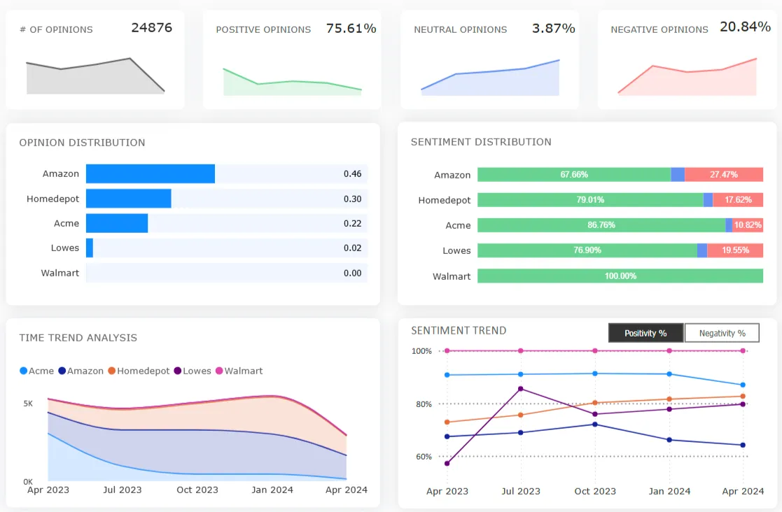
💡 Solution: Use Clootrack to analyze unstructured sources automatically. Clootrack’s unsupervised AI engine delivers 96.5% theme and 98% sentiment accuracy, identifying experience drivers and gaps in real time, without tagging or sampling.
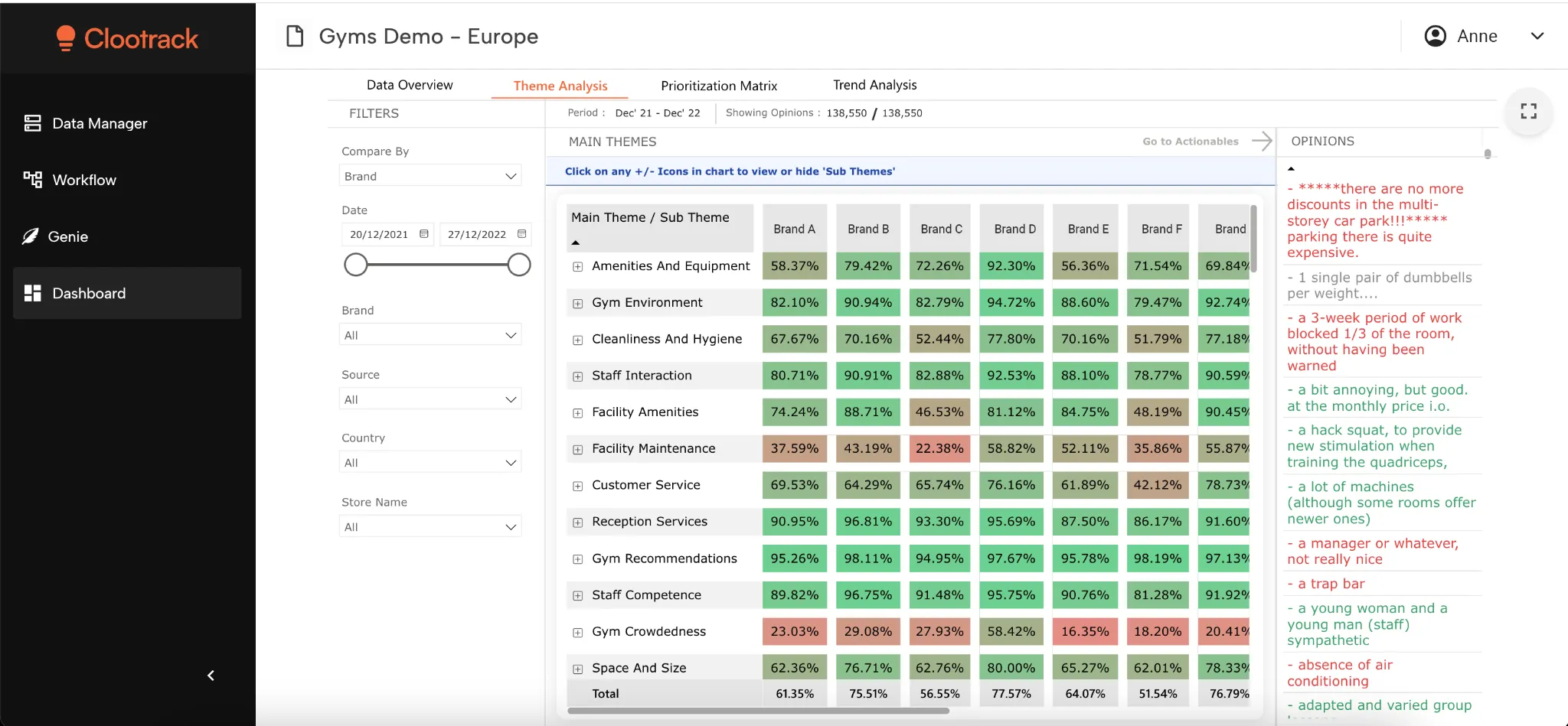
Clootrack’s thematic analysis dashboard reveals critical themes to act on.
When surveys underperform, it’s often due to blind spots in monitoring, not just weak engagement. Without live dashboards and diagnostic insights, teams can’t spot declining participation, segment-specific drop-offs, or channel-level issues until it's too late.
Look for tools that offer:
Real-time dashboards for response rates, engagement, and completion trends
Channel breakdowns across SMS, email, in-app, and more
Trigger-based alerts when performance dips below thresholds
Built-in diagnostics to surface anomalies and response rate shifts
💡 Solution: Platforms like Clootrack centralize survey and unstructured data, enabling early intervention and trend visibility across all feedback channels, helping leaders shift from reactive fixes to proactive experience management.

Clootrack’s trend analysis dashboard reveals crucial and latest trends to beat the competition.
Low participation doesn’t mean abandoning surveys entirely—it means distributing smarter. Instead of over-relying on a single channel, leaders now deploy multichannel feedback strategies that meet customers where they’re most likely to engage.
High-performing multichannel tools support:
Flexible delivery: Email, SMS, WhatsApp, QR, voice, and in-app
Sequenced follow-ups: Trigger SMS if email goes unopened; nudge via app after inaction
Personalized logic: Route by behavior, segment, or journey stage
CRM and product data integration: Power smarter targeting and avoid message fatigue
💡 Tip: The most effective teams use sequencing logic, not channel volume. Intelligent distribution expands your reach without causing overload, and captures feedback from otherwise silent users.
When survey response rates decline, don’t chase participation-evolve your feedback model. Unstructured data, smarter analytics, and multichannel orchestration let you understand customers without waiting for them to fill out a form.
Survey response rate remains a critical signal, but it's no longer the whole story.
The most successful organizations in 2025 aren’t just improving surveys. They’re rethinking the entire feedback system: calculating more accurately, tracking smarter metrics, spotting internal gaps, and expanding beyond traditional methods.
What should leaders do next?
Modernize your measurement stack: Move from static dashboards to real-time, multi-source feedback visibility.
Balance structured and unstructured input: Let AI unlock insights from reviews, conversations, and tickets, not just survey clicks.
Invest in agility: Build a system that adapts when response patterns change, not after.
Don’t just chase higher response rates. Build a listening engine that holds up, even when your audience stops replying. That’s how you future-proof decisions, product direction, and customer trust.
👉 Looking to strengthen your feedback strategy beyond surveys? Book a personalized demo!
A statistically valid survey response rate depends on your desired confidence level and margin of error, typically 95% confidence with a margin of error of ±5%. For a sample of 1,000 customers, you would need approximately 285 completed responses to meet this threshold. That equates to a 28.5% response rate, which aligns with the industry benchmark range of 20–30% used by many CX and market research leaders.
As a rule of thumb, 200+ responses are often considered sufficient for directional decisions, while high-stakes research demands more rigor. Falling below these levels can increase nonresponse bias and reduce the statistical strength of your findings.
Recent benchmarks confirm a growing performance gap between email and SMS survey response rates:
SMS surveys deliver 40 – 50 % response rates, with marketing campaigns often near the higher end and transactional requests around 30 – 40 %.
Email surveys typically yield 15 – 25 %, heavily dependent on personalization, offer clarity, and send timing.
That means SMS achieves 2–3X higher response rates than email, making it a top choice for urgent, mobile-first feedback or short surveys.
Yes, benchmarking can be done effectively without offering incentives. Many organizations rely on natural-response campaigns to set internal performance baselines, focusing instead on optimizing survey type, channel, timing, and messaging.
The key advantage of not using incentives is avoiding motivated response bias, where participants reply for the reward rather than genuine feedback. This helps ensure cleaner, more representative data.
For benchmarking, compare your results to verified industry norms (e.g., email 15–25%, SMS 40–50%, in-app 20–30%). If you're consistently underperforming, that’s usually a sign to revisit your targeting or design strategy, not a reason to add rewards.
Opt-in surveys — where customers voluntarily sign up (e.g., panels or loyalty communities) — typically yield 5–12% response rates, but often suffer from self-selection bias. Respondents may not represent your broader audience, limiting the generalizability of the insights.
Triggered or passive surveys, sent automatically after a specific event (like a purchase or support interaction), usually see 15–30% response rates. Because they’re tied to a real experience in real time, they capture more contextually accurate and representative feedback.
In short, triggered surveys tend to offer greater data reliability, especially for CX, product, or journey-based insights.
To accurately monitor and act on response rates, you need a modern analytics platform with capabilities like:
Live dashboards that show response and drop-off rates
Channel-level tracking for email, SMS, in-app, and more
Alerts when rates fall below set thresholds
Diagnostic insights to uncover anomalies and root causes
Platforms like Clootrack, Qualtrics, and SurveyMonkey Enterprise offer these capabilities.
What sets Clootrack apart is its ability to unify structured survey data with unstructured feedback, such as reviews, chats, and support transcripts, giving leaders a deeper understanding of why response rates change and how to respond with precision.
Analyze customer feedback and automate market research with the fastest AI-powered customer intelligence tool.