🎉 Clootrack recognized by OpenAI for crossing 100 billion tokens in Voice of the Customer analytics →
Read the story


Data visualization improves customer experience decisions by converting large, unstructured feedback sets into clear visual patterns leaders can act on quickly. It surfaces sentiment shifts, recurring issues, and journey friction at a glance, so CX and retail teams move from raw data to confident action without waiting on slow manual analysis.
Customer experience data visualization is the practice of representing customer feedback, sentiment, and journey data as charts, dashboards, and maps, so teams can spot patterns and make experience decisions faster than reading raw data allows.
Most customer experience teams are not short on data. They are short on a way to see it. Surveys, reviews, support calls, and social posts pile up faster than any analyst can read them.
This post explains how visualization converts that flood into decisions, where it breaks down, and how leaders use voice-of-customer intelligence to turn visuals into action. It draws on current research and Clootrack analysis of large-scale customer feedback.
Data visualization matters because it closes the gap between the volume of customer data and the speed leaders need to act on it. A pattern that takes hours to find in a spreadsheet can be obvious in seconds on a chart.
The stakes are measurable. The McKinsey Global Institute reports that data-driven organizations are 23 times more likely to acquire customers, six times more likely to retain them, and 19 times more likely to be profitable. Yet McKinsey also finds only 37% of executives rate their decisions as both high quality and high velocity.
Visualization helps close that quality-velocity gap. Studies cited across business-intelligence research link visualization tools to roughly a 28% improvement in decision-making speed, and Wharton research found visuals can shorten decision meetings by about 24%.
Business implication: in customer experience, a slow decision is a churn decision. A frustration trend that sits unread for a quarter becomes lost customers. Visualizing voice-of-customer signals shortens the distance between a customer saying something and a leader doing something about it.
Visualization turns voice-of-customer data into decisions by making the sentiment, themes, and emotion buried in unstructured text countable, comparable, and visible on a single screen. Scores tell you what happened. Visualized text tells you why.
This matters because roughly 90% of enterprise data is unstructured, much of it customer reviews, support calls, chats, and social posts. A net promoter score moves, but a theme-frequency chart and a sentiment trend line show the specific drivers behind the move, such as delivery delays, a confusing returns flow, or a pricing complaint.
This is the core of voice of customer analytics: unsupervised thematic analysis reads every comment, groups it into themes, and scores sentiment, so a dashboard reflects what customers actually said rather than a sample.
Clootrack data Stat: 100 billion plus tokens of voice-of-customer text analyzed. Definition: cumulative volume of customer feedback language processed by the Clootrack VoC platform.
Sample basis: Clootrack enterprise VoC analytics across categories and channels.
Source: Clootrack, recognized by OpenAI for crossing the 100 billion token milestone.
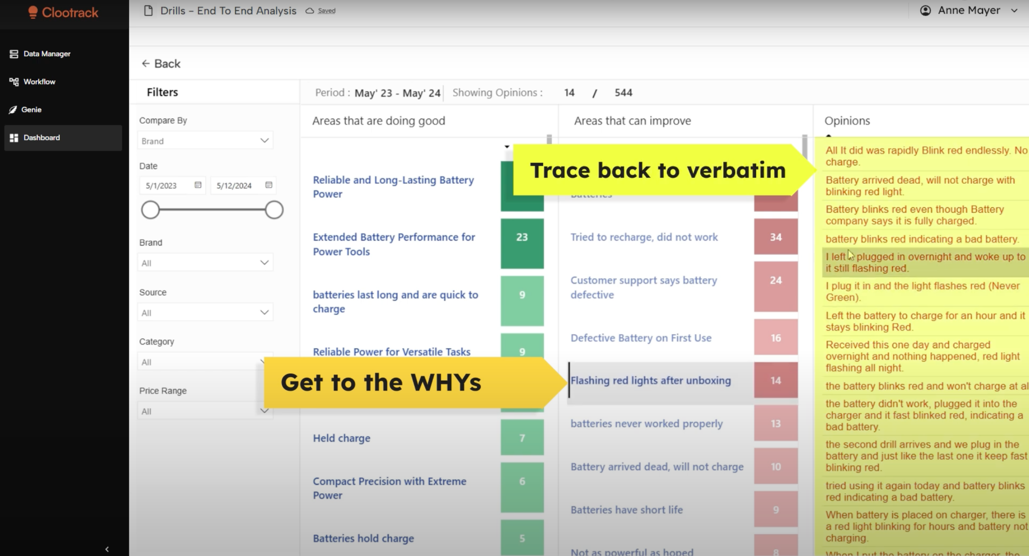
When verbatims sit next to the chart, leaders see the trend and the human sentence behind it in the same view. That pairing is what moves a meeting from debate to action.
The main benefit of data visualization in CX analytics is faster, better-targeted decisions, supported by clearer product, journey, and issue insight. Four benefits recur across mature CX programs.
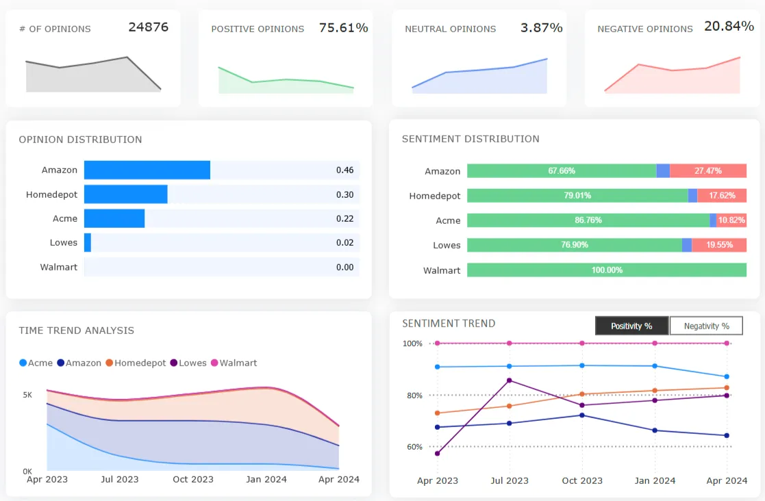
The consumer-behavior layer is the one teams most often skip. Aggregate charts hide the fact that a "good" overall score can mask a segment that is quietly churning. Segmented visuals catch it early.
The best visualization type depends on the CX question, matching the chart form to whether you are tracking a trend, comparing segments, or spotting an outlier. Use the table below as a quick selector.
One rule holds across every type: one chart, one message. A visual that tries to answer three questions usually answers none.
The biggest challenges are data overload, weak actionability, poor communication, and misinterpretation, and each is fixable with better structure and context rather than more charts.
Executive recommendation: treat the dashboard as a decision tool, not a reporting trophy. If a chart cannot be tied to a decision someone will make, cut it. A focused board of five decision-relevant visuals beats a wall of forty.
In retail, data visualization supports category, pricing, and assortment decisions by linking customer sentiment to specific products, brands, and store experiences. The chart stops being about CX in the abstract and starts pointing at a SKU.
A retailer that visualizes sentiment by product line can spot a declining item before the sales report confirms it, because complaints about fit, quality, or value move ahead of revenue. Mapped against competitor sentiment, the same view shows whether the problem is the product or the whole category, which is the heart of competitive benchmarking.
Retail intelligence insight: pairing sentiment with price and assortment intelligence lets merchandising leaders see where a price increase triggered a value complaint, or where a discontinued line still drives loyalty. Those are category decisions, not survey footnotes.
This is also where actionable consumer insights and contact center analytics feed the same picture, so the voice from a support call lands on the same dashboard as the voice from a review.
Customer experience data visualization is moving from static dashboards to conversational, AI-generated answers that explain the why behind every chart. The next dashboard is a question box.
Instead of hunting through tabs, a category manager will ask a plain-language question and get a visual answer with the supporting verbatims attached. Agentic systems will not only show the trend but recommend the action and draft the brief. Conversational analytics tools like Genie already point in this direction.
Strategic outlook: access is consolidating too. Through MCP-powered customer intelligence, assistants such as Claude, ChatGPT, and Copilot can query governed customer experience data directly, so the insight reaches the leader inside the tool they already work in. The visualization stops being a destination and becomes an answer that arrives where the decision is made.
For leaders, the takeaway is to invest now in clean, themed, attributable voice-of-customer data. Conversational and agentic layers are only as trustworthy as the structured feedback underneath them.
Data visualization is no longer a reporting nicety. It is the layer that decides whether customer feedback becomes a decision or dies in a database. The organizations that win treat visuals as decision tools, ground them in attributable voice-of-customer data, and read sentiment, not just scores. Get that right and the gap between what a customer says and what a leader does narrows to almost nothing.
Customer experience data visualization is the use of charts, dashboards, heat maps, and journey maps to represent customer feedback, sentiment, and behavior. It helps teams identify trends and friction points quickly and make experience decisions from patterns rather than from raw, hard-to-read data.
It is important because it converts large volumes of feedback into decisions at the speed business requires. Per McKinsey, data-driven organizations are 23 times more likely to acquire customers. Visualization helps leaders see sentiment shifts and recurring issues early, before they turn into churn.
Line charts work best for sentiment and score trends, bar charts for comparing themes across products or regions, and heat maps for journey friction. Stacked bars show sentiment mix, and scatter plots reveal relationships such as effort versus retention. Match the chart to the question.
It makes unstructured feedback measurable. Voice-of-customer analytics groups open-ended comments into themes and scores sentiment, then visualization shows theme frequency and trend on one screen. Leaders see not just that a score moved, but the specific reasons customers gave in their own words.
Common mistakes include cramming several messages into one chart, omitting the data source and sample size, using truncated axes that exaggerate trends, and reporting aggregate scores that hide a churning segment. Each leads to confident decisions built on a misread of the data.
AI is shifting visualization from static dashboards to conversational answers. Instead of building a chart, leaders ask a question and receive a visual answer with supporting verbatims. Agentic tools also recommend actions, and MCP access lets assistants query governed customer data directly inside everyday work tools.
Teams use business intelligence platforms for dashboards and dedicated voice-of-customer analytics platforms for unstructured feedback. The latter add unsupervised thematic analysis and sentiment scoring, so the visual reflects every comment rather than a sample, and connects the trend to the verbatim behind it.
Share :
Analyze customer reviews and automate market research with the fastest AI-powered customer intelligence tool.
.webp)